Getting Started with Chart.js
Requires basic knowledge of HTML and JavaScript
21 June 2019
Chart.js is an open source, free to use JavaScript charting library. It let's you create standard charts (bar, line, scatter and others) easily. Charts be customised and it's also good at handling large datasets.
If you're looking at creating standard charts on the web I highly recommend considering Chart.js.
This tutorial will get you started with Chart.js. It'll show you how to: create your first chart, explore different chart types and customise a chart.
In order to keep things simple we'll use CodePen to create our charts.
Getting Started
Go to CodePen and create a new pen. (If you're not familiar with CodePen, check out my Visualising Data with JavaScript tutorial.)
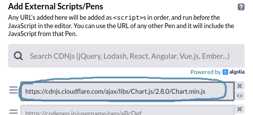
Click on the cog in the JS panel and include Chart.js by adding https://cdnjs.cloudflare.com/ajax/libs/Chart.js/2.8.0/Chart.min.js to the Add External Scripts/Pens list:
Before starting coding, click Change View and select the arrangement with the output window on the right:
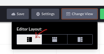
This arrangement will suit your chart better.
Add a container for your chart
Each chart that Chart.js creates requires a <canvas> element in the HTML. (A <canvas> element allows shapes such as circles, lines and rectangles to be added to a webpage.)
Add a <canvas> element to the HTML:
<canvas id="chart"></canvas>The id attribute is a unique identifier and will be used when creating the chart.
Create your first chart
To create a chart using Chart.js call new Chart() and pass in two arguments:
- the id of the canvas element (
'chart') - a configuration object that specifies the chart type, the data and chart options
Add the following to the JS pane:
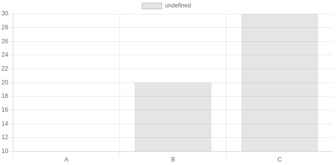
var chart = new Chart('chart', {
  type: 'bar',
  data: {
    labels: ['A', 'B', 'C'],
    datasets: [
      {
        data: [10, 20, 30]
      }
    ]
  }
});
You should see a bar chart appear in the output pane:
The configuration object usually looks like:
{
  type: 'bar',  /* the chart type e.g. 'bar', 'horizontalBar', 'line', 'radar' etc. */
  data: {},     /* an object describing the data */
  options: {}   /* an object to set chart options e.g. style */
}
The structure of data depends on the chart type. For a bar chart it looks like:
{
  labels: ['A', 'B', 'C'],
  datasets: [
    {
      data: [10, 20, 30]
    }
  ]
}
labels is an array specifying the labels that'll appear along the bottom axis. datasets is an array of dataset objects.
Each dataset object describes a data series. In our case we have a single series of data which looks like:
{
  data: [10, 20, 30]
}
Add another data series to datasets:
var chart = new Chart('chart', {
  type: 'bar',
  data: {
    labels: ['A', 'B', 'C'],
    datasets: [
      {
        data: [10, 20, 30]
      },
      {
        data: [50, 30, 40]
      }
    ]
  }
});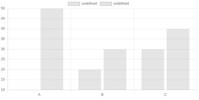
Chart.js creates another set of bars. (The left bars correspond to the first dataset.)
You might be wondering where the first bar is. If you look closely, the y-axis starts at 10. This can be changed to setting an option.
Add an options property after the data object:
var chart = new Chart('chart', {
  type: 'bar',
  data: {
    ...
  },
  options: {
    scales: {
      yAxes: [{
        ticks: {
          beginAtZero: true
        }
      }]
    }
  }
});
(It can get quite confusing because there's several levels of nesting so be careful to insert this code in the right place!)
Styling the chart
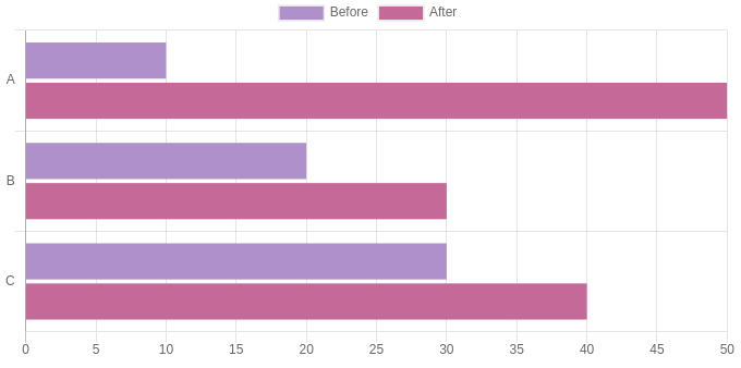
Let's name and colour each dataset. To name a dataset use label and to colour use backgroundColor:
var chart = new Chart('chart', {
  ...
  data: {
    labels: ['A', 'B', 'C'],
    datasets: [
      {
        data: [10, 20, 30],
        label: 'Before',
        backgroundColor: '#af90ca'
      },
      {
        data: [50, 30, 40],
        label: 'After',
        backgroundColor: '#c46998'
      }
    ]
  },
  ...
});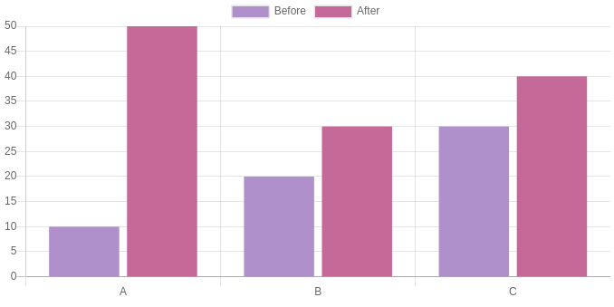
You can make the bars horizontal by changing the chart type to horizontalBar. You'll also need to change yAxes to xAxes in the options.
One of the great things about Chart.js is that it gives you some useful features such as a legend and tooltip. When you hover over a point a tooltip appears describing the data. The legend is clickable: if you click on one of the dataset labels it'll toggle the dataset's visibility.
Here's the complete code on CodePen:
See the Pen Styled Chart.js barchart by Peter Cook (@createwithdata) on CodePen.
Let's look at some of the other chart types.
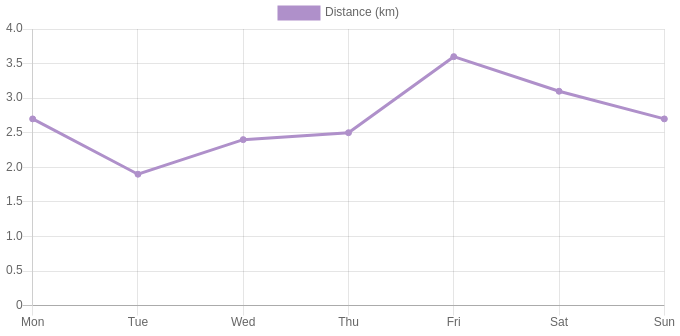
Line chart
Suppose you have some data measured across a week. Your labels will be Monday through to Sunday and your data will consist of 7 values.
Line charts are suitable for showing time based data. Remove all of your JavaScript then copy and paste:
var chart = new Chart('chart', {
  type: 'line',
  data: {
    labels: ['Mon', 'Tue', 'Wed', 'Thu', 'Fri', 'Sat', 'Sun'],
    datasets: [
      {
        data: [2.7, 1.9, 2.4, 2.5, 3.6, 3.1, 2.7],
        borderColor: '#af90ca',
        backgroundColor: '#af90ca',
        fill: false,
        label: 'Distance (km)',
        lineTension: 0
      }
    ]
  },
  options: {
    scales: {
      yAxes: [{
        ticks: {
          beginAtZero: true
        }
      }]
    }
  }
});
The code is mostly the same as the bar chart except for:
- the chart type is
line borderColoris used to set the line colourbackgroundColorsets the colour of the pointsfilldetermines whether the line should be a filled underneathlineTensiondetermines how curved the line should be. Remove this if you prefer a curved line to interpolate the points
Now change the type to radar. There's just one axis so the configuration to make the axis start from zero is slightly different:
var chart = new Chart('chart', {
  type: 'radar',
  ...
  options: {
    scale: {
      ticks: {
        beginAtZero: true
      }
    }
  }
});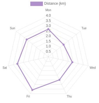
Finally add a title to your chart and move the legend below the chart. This is achieved by adding another couple of options title and legend:
var chart = new Chart('chart', {
  type: 'radar',
  data: {
    ...
  },
  options: {
    scale: {
      ...
    },
    title: {
      display: true,
      fontSize: 18,
      position: 'right',
      text: 'How far did I run this week?'
    },
    legend: {
      position: 'bottom'
    }
  }
});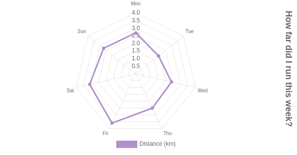
Here's the complete code on CodePen:
See the Pen Radar chart (using Chart.js) by Peter Cook (@createwithdata) on CodePen.
Wrapping up
This tutorial has shown you how to get up and running with Chart.js. You've created three different chart types and seen how they can be configured and styled.
You've also seen how Chart.js provides some useful features out of the box such as a clickable legend and a tooltip.
Moving on
There's lots of other examples on the Chart.js website and the documentation is comprehensive. Try changing the data or configuration of the charts from this tutorial or try creating your own chart from scratch.
If you'd like to learn how to load data from a CSV file (such as exported from a spreadsheet) take a look at my Visualising CSV data with Chart.js tutorial.
AI for Data Visualisation shows you how AI can help you explore, transform and visualise your data.
Find out more
Visualising Data with JavaScript teaches you how to build charts and data stories using Chart.js, Leaflet, D3 and React.
Find out more
Data Dashboards with JavaScript teaches you how to build data dashboards using React, Chart.js and Leaflet.
Find out more
Learn the fundamentals of HTML, SVG, CSS and JavaScript for building data visualisations on the web.
Find out more
"One of the best D3 books I've read. The contents are very clear, it is easy to follow and the concepts are very solid."
D3 Start to Finish teaches you how to build a custom, interactive and beautiful data visualisation using the JavaScript library D3.js.
Find out more