Styling Highcharts in 5 easy steps
Requies moderate experience making web pages using HTML, CSS and a bit of JavaScript/Highcharts
26 July 2018
Highcharts is one of the most popular JavaScript charting libraries and allows a large range of charts (bar, line, pie, area, scatter, bubble) to be added to web pages.
Starting with version 5, charts can now be styled using CSS rules, making it quick and easy to style charts to a particular look and feel.
This tutorial shows how to take a chart like:
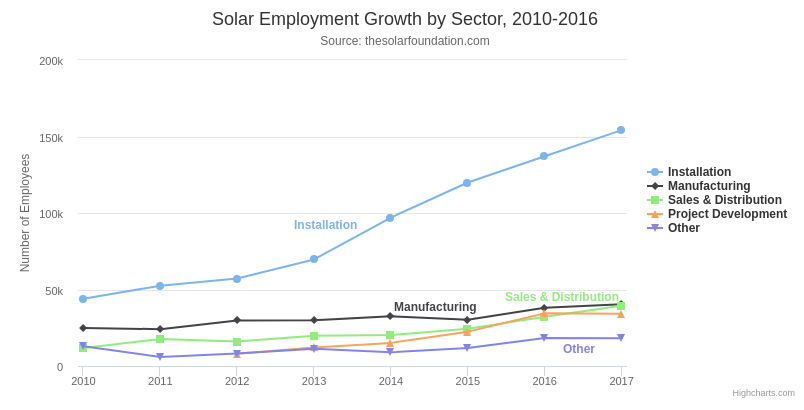
and style it to become:
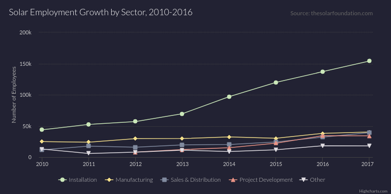
This finished chart is in a Codepen so do open that and explore. There's also a walkthrough of the finished code on Youtube.
Let's go through the 5 steps one by one.
1. Load 'Styled Mode' version of Highcharts
Styled mode is a Highcharts version which separates the functionality of the chart from the style. If you load the styled mode version of Highcharts your chart can be styled using CSS rules.
The styled mode version of Highcharts is a separate branch found under the /js directory of the root directory. To include this in your project use something like:
<script src="https://code.highcharts.com/5.0.0/js/highcharts.js"></script>You'll also need to include a default stylesheet. Without this, the chart will just appear as an unstyled mess!
<link href="https://code.highcharts.com/5.0.0/css/highcharts.css" rel="stylesheet" type="text/css">2. Add a CSS file for style changes
Now we can add a CSS file to contain any style changes we wish to make.
Create a CSS file and make sure to include it in your page:
<link href="css/chart-style.css" rel="stylesheet" type="text/css">3. Add new CSS rules
Let's add some rules to our CSS file!
Start by changing the background colour. The Highcharts documents have a useful guide showing the CSS selectors for each element in the chart. Using this guide we can see that the selector for the background rectangle is .highcharts-background so let's go ahead and add a new CSS rule:
.highcharts-background {
  fill: #223;
}
We can continue to add rules for each element in the chart. For example we can change the font using:
.highcharts-container {
  font-family: "Lato", sans-serif;
}
(Don't forget to include the Google Font code in the header!)
Other selectors we've used to style the chart are: .highcharts-title (for the main title), .highcharts-legend-item (for legend items), .highcharts-axis (for the axes), .highcharts-axis-labels (for the axis labels), .highcharts-grid for the background grid and .highcharts-graph for the lines.
See the CSS files in the codepen to see the exact changes.
4. Add colour palette
Each series in the chart is assigned a specific class name starting .highcharts-color-0 etc. We'll select some colours from the colour palette generator Coolors and add some more rules to change the colour of each line:
.highcharts-color-0 {
  fill: #CAE7B9;
  stroke: #CAE7B9;
}

.highcharts-color-1 {
  fill: #F3DE8A;
  stroke: #F3DE8A;
}

.highcharts-color-2 {
  fill: #808A9F;
  stroke: #808A9F;
}

.highcharts-color-3 {
  fill: #EB9486;
  stroke: #EB9486;
}

.highcharts-color-4 {
  fill: #E1DEE3;
  stroke: #E1DEE3;
}
We're almost there!
5. Re-arrange elements
We'll now shift things around a bit to maximise the size of the actual chart and tidy things up.
Generally anything related to positioning will be a chart option rather than a CSS rule so we'll need to modify the JavaScript code.
Let's start by aligning the title left, the subtitle right and the legend bottom:
Highcharts.chart('container', {
  ...
  title: {
    text: 'Solar Employment Growth by Sector, 2010-2016',
    align: 'left'
  },

  subtitle: {
    text: 'Source: thesolarfoundation.com',
    align: 'right',
    y: 14
  },

  legend: {
    verticalAlign: 'bottom'
  },
  ...
})
and finally we'll adjust the padding:
Highcharts.chart('container', {
  ...
  chart: {
    spacingTop: 20,
    spacingBottom: 20,
    spacingLeft: 20,
    spacingRight: 40
  },
  ...
})
That's it! Have a look at the finished chart in the codepen and see what changes you can make yourself.
Code
See the Pen Highcharts Styling (before) by Frontend Charts (@frontendcharts) on CodePen.
See the Pen Highcharts line chart by Frontend Charts (@frontendcharts) on CodePen.
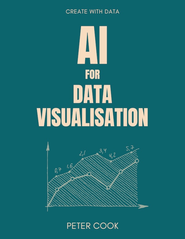
AI for Data Visualisation shows you how AI can help you explore, transform and visualise your data.
Find out more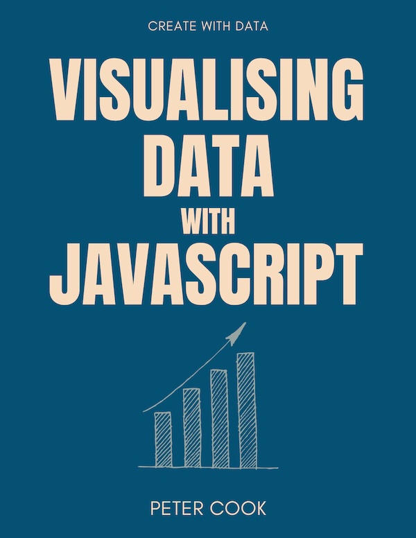
Visualising Data with JavaScript teaches you how to build charts and data stories using Chart.js, Leaflet, D3 and React.
Find out more
Data Dashboards with JavaScript teaches you how to build data dashboards using React, Chart.js and Leaflet.
Find out more
Learn the fundamentals of HTML, SVG, CSS and JavaScript for building data visualisations on the web.
Find out more
"One of the best D3 books I've read. The contents are very clear, it is easy to follow and the concepts are very solid."
D3 Start to Finish teaches you how to build a custom, interactive and beautiful data visualisation using the JavaScript library D3.js.
Find out more