Creating a dashboard with React and Chart.js
Requires intermediate knowledge of JavaScript/ES6 and experience with React and Chart.js. For a more detailed tutorial read Data Dashboards with JavaScript.
28 January 2019
In this tutorial I show you how to integrate Chart.js and React to create a dashboard (visit dashboard):
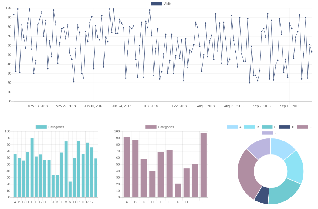
We'll create React components for 3 chart types: line, bar and doughnut. The dashboard will also update if the data updates.
If you'd like a more detailed tutorial on dashboards that includes:
- tutorials on React and Chart.js
- how to use React hooks to integrate React and Chart.js
- how to build an API for a dashboard
- how to build a dashboard that fetches its data from an API
- how to add a Leaflet map to a dashboard
then I recommend my Data Dashboards with JavaScript book.
Background
React is one of the most popular JavaScript libraries for creating user interfaces. Likewise Chart.js is one of the most popular JavaScript libraries for creating charts. As we'll see in this tutorial the two libraries integrate smoothly.
Chart.js renders to the Canvas element which means we don't have to worry about which library manages the DOM. (React will take care of everything DOM related while Chart.js is responsible for drawing to a Canvas element.)
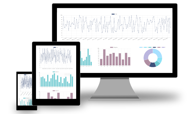
Chart.js has built-in support for tooltips, animation and pretty good support for responsiveness. Yes... this dashboard is responsive!
Our approach
This tutorial shows how to integrate React and Chart.js without the use of another library (such as react-chartjs-2). We're not going to use a wrapper in this tutorial because:
- we'd like to retain as much direct control over Chart.js as we can
- we'd like to deepen our understanding of integrating a charting library such as Chart.js with React
- we'd like to abstract away Chart.js's data structures in our chart components
- it's not all that difficult to integrate React and Chart.js
Our chart components will have an interface similar to:
<BarChart
  data={myData}
  title="My amazing data"
  color="#70CAD1"
/>
where the data attribute is an array of objects:
[
  {
    "label": "Apples",
    "value": 10
  },
  {
    "label": "Oranges",
    "value": 17
  },
  ...
]
The complete code is in this Codepen pen. (I originally created this dashboard using create-react-app then copy and pasted the code into Codepen.)
Test data generation
We'll start by writing a function getFeeds that generates the test data:
function getFeeds() {
  let feeds = [];

  feeds.push({
    title: 'Visits',
    data: getRandomDateArray(150)
  });

  feeds.push({
    title: 'Categories',
    data: getRandomArray(20)
  });

  feeds.push({
    title: 'Categories',
    data: getRandomArray(10)
  });

  feeds.push({
    title: 'Data 4',
    data: getRandomArray(6)
  });

  return feeds;
}
This function creates an array containing 4 datasets (or feeds). The first feed is an object representing a time series:
{
  "title": "Visits",
  "data": [
    {
      "time": Tue May 01 2018 00:00:00 GMT+0100 (British Summer Time),
      "value": 39
    },
    {
      "time": Wed May 02 2018 00:00:00 GMT+0100 (British Summer Time),
      "value": 60
    },
    ...
  ]
}
The remaining 3 feeds are objects representing categorical data. For example:
{
  "title": "Categories",
  "data": [
    {
      "label": "A",
      "value": 46
    },
    {
      "label": "B",
      "value": 87
    },
    ...
  ]
}(getFeeds calls two functions getRandomArray and getRandomDateArray which generate arrays of objects. See the finished code if you're interested in seeing how these functions are implemented.)
Bar chart component
Now we'll create a component for making a bar chart. Our component will have 3 attributes:
<BarChart
  data={myData}
  title="My amazing data"
  color="#70CAD1"
/>
The first attribute data is an array of data:
[
  {
    "name": "A",
    "value": 46
  },
  {
    "name": "B",
    "value": 87
  },
  ...
]
while title is the chart title and color is the bar colour.
Start by creating a simple class component named BarChart:
class BarChart extends React.Component {
  render() {
    return <canvas />
  }
}
This renders a single <canvas /> element that'll contain our chart. We'll need to reference the Canvas element when the chart is created so add a React ref to the component:
class BarChart extends React.Component {
  constructor(props) {
    super(props);
    this.chartRef = React.createRef();
  }

  render() {
    return (
      <canvas ref={this.chartRef} />
    );
  }
}
(We're using the createRef() API introduced in React 16.3.)
Now add a componentDidMount method which instantiates a Chart.js bar chart:
componentDidMount() {
  this.myChart = new Chart(this.canvasRef.current, {
    type: 'bar'
  });
}
Note that the first argument to the Chart constructor is the reference to the canvas element.
Chart.js requires its data property to be structured like:
{
  labels: ['A', 'B', 'C', ...],
  datasets: [{
    label: 'My data',
    data: [10, 20, 30, ...],
    backgroundColor: '#112233'
  }]
}
so we need to transform this.props.data, this.props.title and this.props.color accordingly:
{
  labels: this.props.data.map(d => d.label),
  datasets: [{
    label: this.props.title,
    data: this.props.data.map(d => d.value),
    backgroundColor: this.props.color
  }]
}
Here's how componentDidMount now looks:
componentDidMount() {
  this.myChart = new Chart(this.canvasRef.current, {
    type: 'bar',
    data: {
      labels: this.props.data.map(d => d.label),
      datasets: [{
        label: this.props.title,
        data: this.props.data.map(d => d.value),
        backgroundColor: this.props.color
      }]
    }
  });
}
The dashboard component
We'll now create the main dashboard component. We initialise this.state using getFeeds and render a single BarChart:
class App extends React.Component {
  constructor(props) {
    super(props);

    this.state = {
      feeds: getFeeds()
    };
  }

  render() {
    return (
      <div className="App">
        <BarChart
          data={this.state.feeds[1].data}
          title={this.state.feeds[1].title}
          color="#70CAD1"
        />
      </div>
    );
  }
}
Render the App component and you should see a bar chart:
ReactDOM.render(<App />, document.getElementById('root'));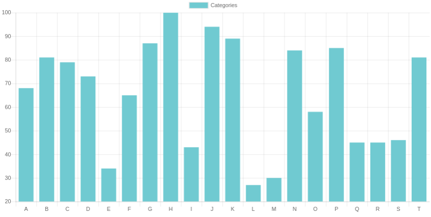
Bar chart configuration
The y-axis in the above bar chart starts at a non-zero value. This is generally considered bad practice so we'll configure the minimum and maximum of the y-axis:
componentDidMount() {
  this.myChart = new Chart(this.canvasRef.current, {
    type: 'bar',
    options: {
      scales: {
        yAxes: [
          {
            ticks: {
              min: 0,
              max: 100
            }
          }
        ]
      }
    },
    ...
  });
}
Data updates
We'll now add support for data updates. Add an interval timer to App which requests new data and uses setState to update this.state.feeds:
// App component
componentDidMount() {
  window.setInterval(() => {
    this.setState({
      feeds: getFeeds()
    })
  }, 5000)
}
Every 5 seconds the component state changes triggering a re-render. This in turn causes componentDidUpdate in the BarChart component to be called.
A Chart.js chart can be updated by mutating the data arrays (either by supplying a new array or changing the array values) and calling this.myChart.update().
In our case we'll update the data.labels and data.datasets[0].data properties of this.myChart and call this.myChart.update():
// BarChart component
componentDidUpdate() {
  this.myChart.data.labels = this.props.data.map(d => d.label);
  this.myChart.data.datasets[0].data = this.props.data.map(d => d.value);
  this.myChart.update();
}
Line and pie chart components
We'll add components for the line and doughnut charts. They'll follow the same form as the BarChart, the main difference being the type property. The line chart also needs some configuration to set the x axis type to time and some additional styling:
class LineChart extends React.Component {
  constructor(props) {
    super(props);
    this.chartRef = React.createRef();
  }

  componentDidUpdate() {
    this.myChart.data.labels = this.props.data.map(d => d.time);
    this.myChart.data.datasets[0].data = this.props.data.map(d => d.value);
    this.myChart.update();
  }

  componentDidMount() {
    this.myChart = new Chart(this.chartRef.current, {
      type: 'line',
      options: {
        scales: {
          xAxes: [
            {
              type: 'time',
              time: {
                unit: 'week'
              }
            }
          ],
          yAxes: [
            {
              ticks: {
                min: 0
              }
            }
          ]
        }
      },
      data: {
        labels: this.props.data.map(d => d.time),
        datasets: [{
          label: this.props.title,
          data: this.props.data.map(d => d.value),
          fill: 'none',
          backgroundColor: this.props.color,
          pointRadius: 2,
          borderColor: this.props.color,
          borderWidth: 1,
          lineTension: 0
        }]
      }
    });
  }

  render() {
    return <canvas ref={this.chartRef} />;
  }
}
Here's the DoughnutChart component:
class DoughnutChart extends React.Component {
  constructor(props) {
    super(props);
    this.chartRef = React.createRef();
  }

  componentDidUpdate() {
    this.myChart.data.labels = this.props.data.map(d => d.label);
    this.myChart.data.datasets[0].data = this.props.data.map(d => d.value);
    this.myChart.update();
  }

  componentDidMount() {
    this.myChart = new Chart(this.chartRef.current, {
      type: 'doughnut',
      data: {
        labels: this.props.data.map(d => d.label),
        datasets: [{
          data: this.props.data.map(d => d.value),
          backgroundColor: this.props.colors
        }]
      }
    });
  }

  render() {
    return <canvas ref={this.chartRef} />;
  }
}
Now update the App component's render method to use all 3 chart types:
render() {
  return (
    <div className="App">
      <div className="main chart-wrapper">
        <LineChart
          data={this.state.feeds[0].data}
          title={this.state.feeds[0].title}
          color="#3E517A"
        />
      </div>
      <div className="sub chart-wrapper">
        <BarChart
          data={this.state.feeds[1].data}
          title={this.state.feeds[1].title}
          color="#70CAD1"
        />
      </div>
      <div className="sub chart-wrapper">
        <BarChart
          data={this.state.feeds[2].data}
          title={this.state.feeds[2].title}
          color="#B08EA2"
        />
      </div>
      <div className="sub chart-wrapper">
        <DoughnutChart
          data={this.state.feeds[3].data}
          title={this.state.feeds[3].title}
          colors={['#a8e0ff', '#8ee3f5', '#70cad1', '#3e517a', '#b08ea2', '#BBB6DF']}
        />
      </div>
    </div>
  );
}
This results in 4 charts which update every 5 seconds:
Dashboard layout
The charts are rendered one above the other. However if there's sufficient width we'd prefer the line chart to be full width and the remaining charts to occupy the bottom row.
We'll wrap each chart in a div element and add a main class to the line chart and a sub class to the remaining charts:
render() {
  return (
    <div className="App">
      <div className="main chart-wrapper">
        <LineChart
          data={this.state.feeds[0].data}
          title={this.state.feeds[0].title}
          color="#3E517A"
        />
      </div>
      <div className="sub chart-wrapper">
        <BarChart
          data={this.state.feeds[1].data}
          title={this.state.feeds[1].title}
          color="#70CAD1"
        />
      </div>
      <div className="sub chart-wrapper">
        <BarChart
          data={this.state.feeds[2].data}
          title={this.state.feeds[2].title}
          color="#B08EA2"
        />
      </div>
      <div className="sub chart-wrapper">
        <DoughnutChart
          data={this.state.feeds[3].data}
          title={this.state.feeds[3].title}
          colors={['#a8e0ff', '#8ee3f5', '#70cad1', '#3e517a', '#b08ea2', '#BBB6DF']}
        />
      </div>
    </div>
  );
}
We'll add the following CSS to add some padding around each chart, make the main chart full width and the remaining charts a third of the width (so long as the screen width is greater than 700px):
.chart-wrapper {
  padding: 2%;
  width: 96%;
  display: inline-block;
}

.main.chart-wrapper {
  height: 400px;
}

.sub.chart-wrapper {
  height: 300px;
}

@media (min-width: 700px) {
  .sub.chart-wrapper {
    width: 29%;
  }
}
And finally we set the maintainAspectRatio option on all 3 chart components to false. This makes Chart.js fit the chart to its containing element.
componentDidMount() {
this.myChart = new Chart(this.chartRef.current, {
...
options: {
maintainAspectRatio: false,
...
},
...
}
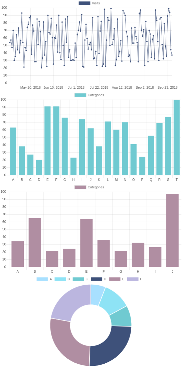
}Now our dashboard looks like:
The code
The finished code is here on Codepen:
See the Pen Chart.js / React simple dashboard by Peter Cook (@createwithdata) on CodePen.

AI for Data Visualisation shows you how AI can help you explore, transform and visualise your data.
Find out more
Visualising Data with JavaScript teaches you how to build charts and data stories using Chart.js, Leaflet, D3 and React.
Find out more
Data Dashboards with JavaScript teaches you how to build data dashboards using React, Chart.js and Leaflet.
Find out more
Learn the fundamentals of HTML, SVG, CSS and JavaScript for building data visualisations on the web.
Find out more
"One of the best D3 books I've read. The contents are very clear, it is easy to follow and the concepts are very solid."
D3 Start to Finish teaches you how to build a custom, interactive and beautiful data visualisation using the JavaScript library D3.js.
Find out more