Recreating Gapminder using Chart.js
24 January 2019
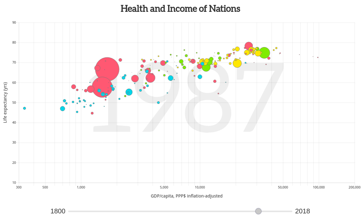
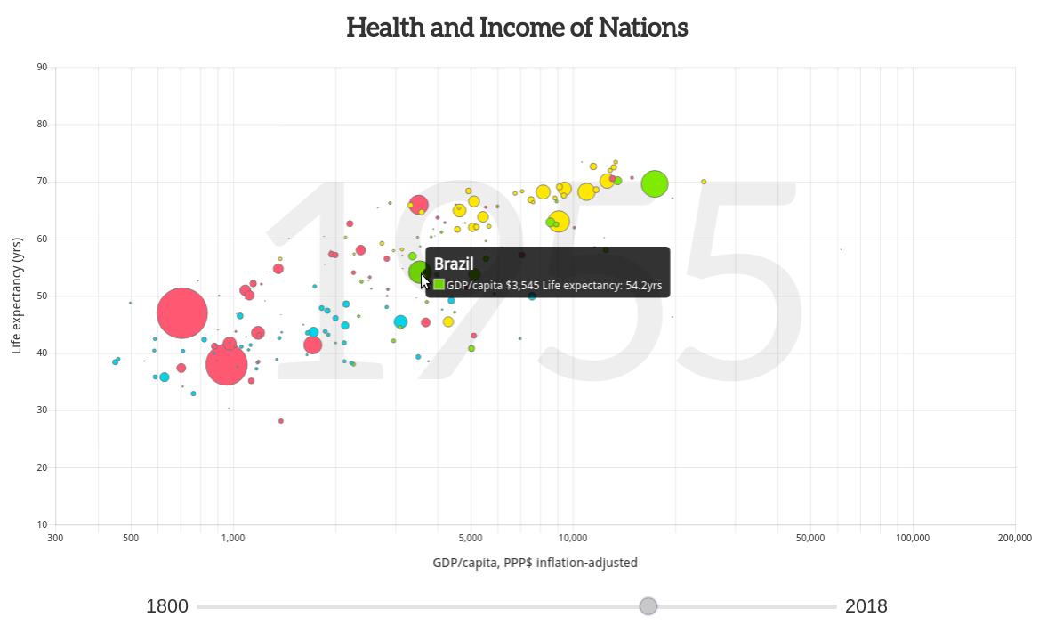
One of the most well known data visualisations is Hans Rosling's Gapminder where the relationship between GDP, life expectancy and population of over 180 nations is animated across time. The result gives a fascinating insight into the evolution of nations over the years. It's made especially more insightful (and entertaining) when Hans himself stands in front of the animation and commentates.
How do you go about creating a chart such as this? Other developers have done so such as Mike Bostock (using D3.js), Tristan Ganry (using R), Robert Mundigi (in Excel) and Parul Pandey (in Tableau).
I thought I'd try re-creating a Gapminder chart using Chart.js. This is an free and open source JavaScript library for creating charts in a web browser. It allows standard charts (such as bar, line, pie and scatter) to be created with minimal coding.
The final result looks close to the original including a slider to select the displayed year:
You can view the complete source code on Codepen.
The Data
I downloaded data for GDP, life expectancy and population from the Gapminder website (here, here and here) and wrote some code to transform the files into an array of objects, where each object represents a nation. Each nation has an array representing GDP, life expectancy and population for each year:
[
  {
    country: "Afghanistan",
    gdp: [603, 603, 603, 603, 603, ...],
    lifeExpectancy: [28.21, 28.2, 28.19, 28.18, 28.17, ...],
    population: [3280000, 3280000, 3280000, 3280000, 3280000, ...],
    region: "asia"
  },
  {
    country : "Albania",
    gdp: [667, 667, 667, 667, 667, ...],
    lifeExpectancy: [35.4, 35.4, 35.4, 35.4, 35.4, ...],
    population: [410445, 411734, 413026, 414323, 415624, ...],
    region: "europe"
  },
  ...
]
This was saved as a JSON file and hosted on Codepen.
Load and transform data
I loaded the data using D3's .json function and assigned the JSON to a global variable countries:
d3.json('https://s3-us-west-2.amazonaws.com/s.cdpn.io/2814973/gapminder.json')
  .then(function(json) {
    countries = json;

    initChart();
    update();
});
When the data has loaded, two functions are called: initChart to initialise a bubble chart and update to update the chart.
Bubble chart
I used Chart.js's built in chart type bubble. This is a scatter plot where each circle is sized according to a third variable:
var myChart;

var ctx = document.getElementById("myChart").getContext('2d');

function initChart() {
  myChart = new Chart(ctx, {
    type: 'bubble'
  });
}
The data structure required for a bubble chart is along the lines of:
{
  datasets: [
    {
      data: [
        { x: 10, y: 20, r: 30 },
        { x: 40, y: 50, r: 60 },
        ...
      ],
      backgroundColor: [
        '#112233',
        '#445566',
        ...
      ],
      borderColor: '#777'
    }
  ]
}
I added a function getDataset to transform the countries array into this structure. There were a few steps to this function:
- get the data for the chosen year
- filter out nations without data
- sort so that small circles render in front
- transform into structure required by Chart.js
var startYear = 1800, endYear = 2018, chosenYear = 1800;

var rScale = d3.scaleSqrt().domain([0, 5e8]).range([0, 30]);

var regionColor = {
  americas: 'rgb(127, 235, 0)',
  europe: 'rgb(255, 231, 0)',
  africa: 'rgb(0, 213, 233)',
  asia: 'rgb(255, 88, 114)'
};

function getDataset() {
  var i = chosenYear - startYear;

  // Get the data for chosenYear
  var data = countries.map(function(d) {
    return {
      country: d.country,
      region: d.region,
      gdp: +d.gdp[i],
      exp: +d.lifeExpectancy[i],
      pop: +d.population[i],
    };
  });

  // Filter out nations w/out data
  data = data.filter(function(d) {return d.gdp && d.exp && d.pop;});

  // Sort by population size so that small circles are in front
  data = sortBy(data, function(d) {return -d.pop;});

  // Get data array (in structure required by Chart.js)
  var points = data.map(function(d) {
    return {
      x: d.gdp,
      y: d.exp,
      r: rScale(d.pop)
    };
  });

  // Get color array
  var colors = data.map(function(d) {return regionColor[d.region];});

  // Get label array
  var labels = data.map(function(d) {return d.label;});

  // Create dataset
  var dataset = {
    data: points,
    backgroundColor: colors,
    borderColor: '#777',
    myLabels: labels
  };

  return dataset;
}
I then wrote the update function that updates Chart.js:
function update() {
  myChart.data = {
    datasets: [getDataset()]
  };
  myChart.update();
}
Running this gave the output:
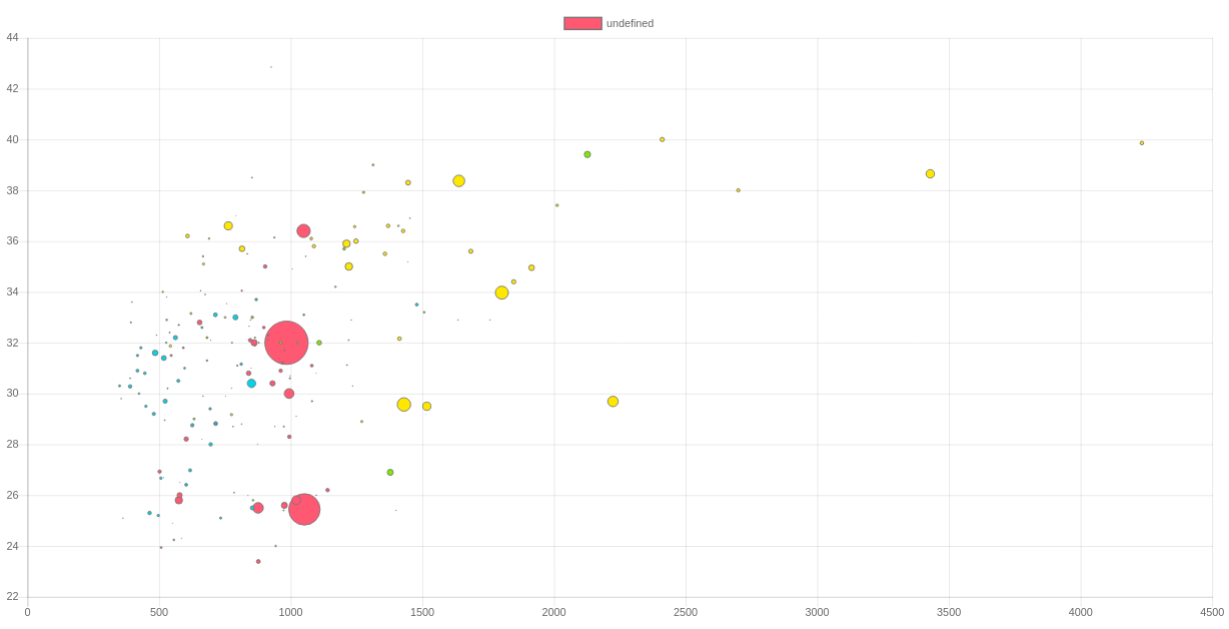
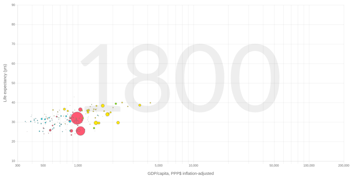
It's always satisfying to see the first view of the data!
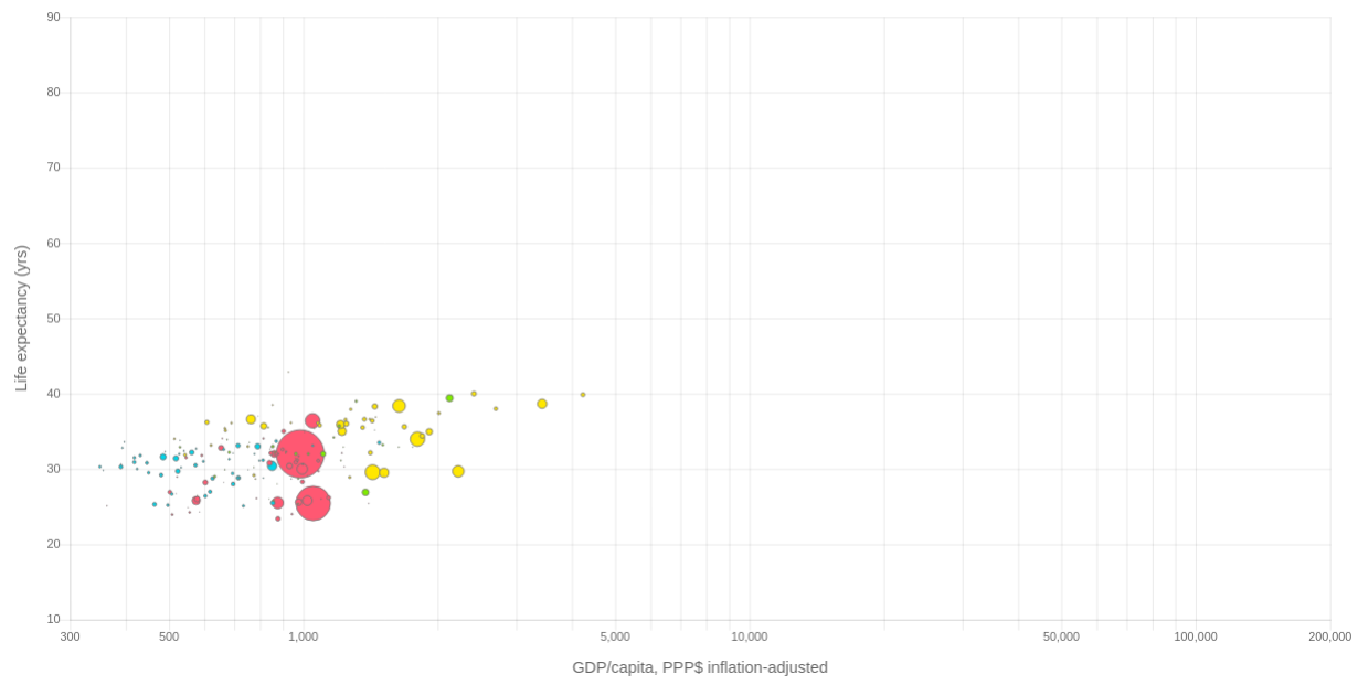
At this point I configured the chart so that:
- the x-axis is logarithmic
- both the x and y axes have fixed start and end values (so that when the chart animates the axes stay the same)
- axis have labels
- x-axis tick marks don't overlap
- legend is hidden
All the above was done through Chart.js's options object:
var incomeFormat = d3.format(',');

function initChart() {
  myChart = new Chart(ctx, {
    type: 'bubble',
    options: {
      legend: {
        display: false,
      },
      scales: {
        yAxes: [{
          ticks: {
            min: 10,
            max: 90
          },
          scaleLabel: {
            display: true,
            labelString: 'Life expectancy (yrs)',
            fontSize: 16,
            lineHeight: 2
          }
        }],
        xAxes: [{
          type: 'logarithmic',
          ticks: {
            min: 300,
            max: 2e5,
            callback: function(value) {
              var ticks = [300, 500, 1000, 5000, 10000, 50000, 100000, 200000];
              return ticks.indexOf(value) === -1 ? '' : incomeFormat(value);
            }
          },
          scaleLabel: {
            display: true,
            labelString: 'GDP/capita, PPP$ inflation-adjusted',
            fontSize: 16,
            lineHeight: 2
          }
        }]
      }
    }
  });
}
Now the chart looks like:
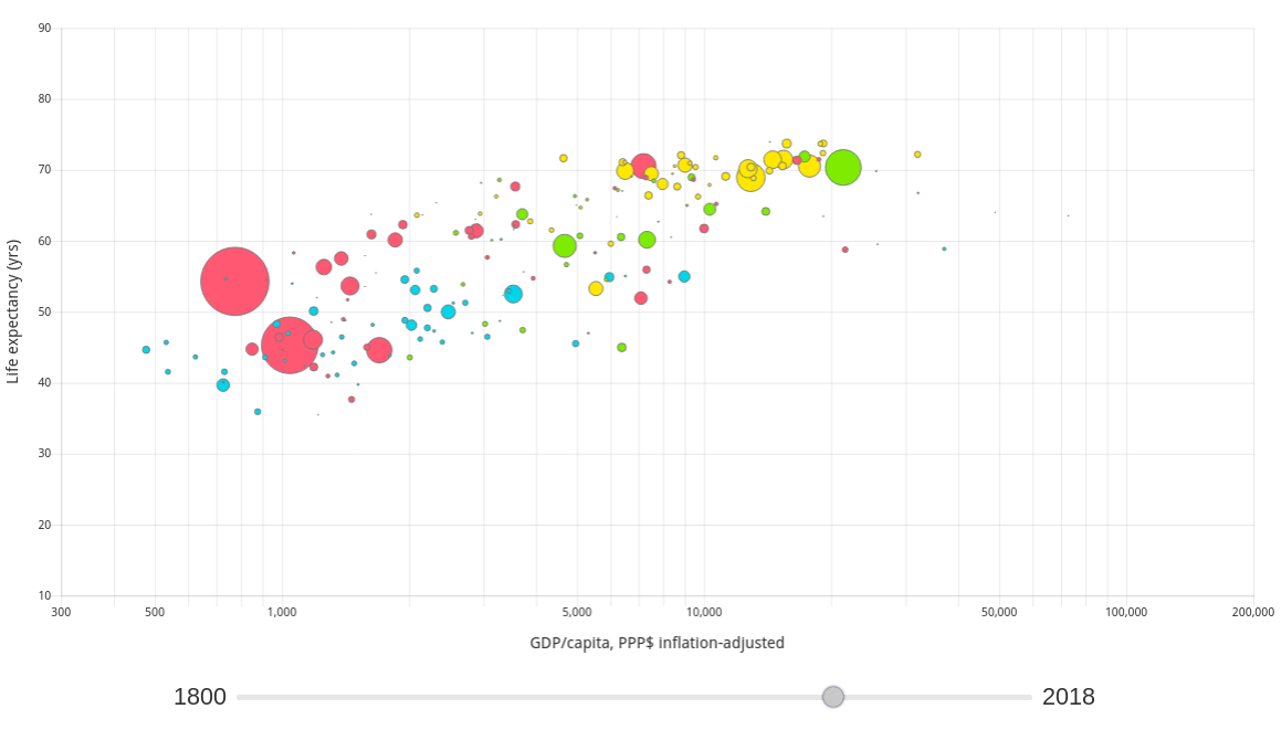
Animation
I then added an HTML range input for selecting the year:
<div id="year-slider-wrapper">
  <label>1800</label>
  <input id="year-slider" type="range" min="1800" max="2018" style="width: 800px;" value="1800" />
  <label>2018</label>
</div>
and added an event handler for when its value changed:
document.getElementById('year-slider').addEventListener('input', function(e) {
  chosenYear = e.target.value;
  update();
});
Year label
The original Gapminder chart displays the chosen year as large background text. The way the Canvas element works is that any new drawing will be placed on top of any existing output. Therefore the year label needs to be drawn before the data points.
I was able to do this by writing a plug-in that gets called before the main draw:
var yearLabelPlugin = {
  beforeDraw() {
    myChart.ctx.save();
    var geom = myChart.chartArea;
    var w = geom.right - geom.left;
    var h = geom.bottom - geom.top;
    var fontSize = h * 0.6;

    // Draw background year label
    myChart.ctx.textAlign = 'center';
    myChart.ctx.textBaseline = 'middle';
    myChart.ctx.fillStyle= '#eee';
    myChart.ctx.font = fontSize + 'px Aleo';
    myChart.ctx.fillText(year, geom.left + 0.5 * w, geom.top + 0.5 * h);
    myChart.ctx.restore();
  }
}
Final touches
Finally I added some Google fonts (Open Sans and Aleo), styled the year slider, configured the tooltip and added a title:
Summary
The exercise of recreating the Gapminder chart using Chart.js went well. Most of the work was in transforming the data into the structure required by Chart.js (see the getDataset function). Apart from that, it was mainly a case of configuring the chart so that it had the right look and feel.
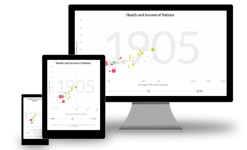
Another bonus of using Chart.js is that the chart is responsive with only a little extra work:
Click here to see the interactive chart.
The code is here on Codepen:
See the Pen Chart.js Gapminder by Peter Cook (@createwithdata) on CodePen.
AI for Data Visualisation shows you how AI can help you explore, transform and visualise your data.
Find out more
Visualising Data with JavaScript teaches you how to build charts and data stories using Chart.js, Leaflet, D3 and React.
Find out more
Data Dashboards with JavaScript teaches you how to build data dashboards using React, Chart.js and Leaflet.
Find out more
Learn the fundamentals of HTML, SVG, CSS and JavaScript for building data visualisations on the web.
Find out more
"One of the best D3 books I've read. The contents are very clear, it is easy to follow and the concepts are very solid."
D3 Start to Finish teaches you how to build a custom, interactive and beautiful data visualisation using the JavaScript library D3.js.
Find out more